
Saturday, 27 November 2010
Music Magazine: Contents Page Aspiration
Thursday, 25 November 2010
Music Magazine: Third Draft

Thursday, 18 November 2010
Music Magazine: Magazine Cover Draft 2

Music Magazine: Magazine: Cover Draft 1 Analyisis

Wednesday, 17 November 2010
Music Magazine: Magazine Cover Draft 1
Currently I have been busy working on my magazine front cover and due to some technical issue which involved me losing my work, resulting in me losing my current progress I have had to start again and which resulted in lack of postings recently.
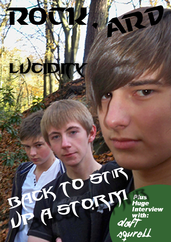 This is my first draft of my magazine it is only a basic mock up therefore I will add addintional thing to it upon later mock ups. I will also need to change fonts and add extras like cross heads and a band logo.
Wednesday, 10 November 2010
Music Magazine: Layout Results
The results for my layout templates are that the more decorative layout 3 is the more popular design, maybe because the design appealed to the more mass market the result are as followed:
Layout 1: 2
Layout 2: 2
Layout 3: 7
Layout 1: 2
Layout 2: 2
Layout 3: 7
Tuesday, 9 November 2010
Music Magazine: Research Conventions 2

 which shows their domance of the page. The splash segrigates their faces from their bodies which shows the most important thing on the page is the bands faces rather than the legs. Other conventions include the pug in the top right corner depicting that the readers will get a free CD and the postitions of the cross heads in the bottom right side is generally a place where they would go.
 This a semi-conventional magazine cover. The main unconventionals are that Dave Mustane is covering most the magazine title which makes the M and the A very hard to see and shows his dominance. The editing aswell is unconvtional since his hair looks as if it is set on fire and the lighting storm. It is very rare on magazine covers that elements will be merged most will stick to ethier. The cover also features some irony by using slang that would not be used by the readers of the magazine "well 80's issue" the use of arupt language on the cover aswell shows that this magazine appeals to those of a more older taste. The conventions that are normal are three giant splashs which cover most of the picture and the most important one about Megadeth is nearer the top and stands out the most due it being about Dave Mustane.
Monday, 8 November 2010
Music Magazine: Research Conventions 1

Sunday, 7 November 2010
Music Magazine: Camera Shot Usage

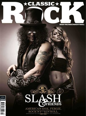
This is a medium shot. It covers the waist upwards. This shot of Slash and Fergie also has a low angle to it aswell which is used to make Slash and Fergie seem taller and therefore more dominating than they actually are. This cover also uses a lot of added effects like the skin tone on Fergie, enhanced muscles on Slash (come on hes a guitar player not a weight lifter) and obviously a snake on Slashes arm. A medium shot is a good idea for a double page spread and cover. I would personally like Classic Rock's idea of the medium shot however the CGI on the picture is a little extreme.

A long shot captures the whole body in the shot. It is great for capturing whole poses of people like this picture of Lily Allen which shows her as cheeky since she is not showing her face and has her back turned to the readers. It also gives a sense of distance that you do not get with the other shots.


Friday, 5 November 2010
Music Magazine: Photoshoot
Tomorrow I am taking Lucidity for a photoshoot I will post my photo roll on to Blogger at the end of the shoot
Thursday, 4 November 2010
Music Magazine: Layout Research 3

Music Magazine: Layout Research 2

Music Magazine: Layout Research 1

Wednesday, 3 November 2010
Music Magazine: Band Name
The band I am using to is called Lucidity this is there band name logo. I will have to incorporate this on the cover of the magazine

Music Magazine: Masthead Font Result

Starcraft: 5
Cowboys: 2
Daft Font: 2
Pirates: 0
Space Marine: 3
The Starcraft font was trhe most liked by my peers so I shall oblige and use my Starcraft font to display the masthead.
Tuesday, 2 November 2010
Music Magazine: Colour Scheme


 I am now going towards the idea of making my music magazine, to do this I need a colour scheme based on the genre of my magazine; Metal/ Rock. Using my research I discovered that most magazines of that genre etheir for a cover use a dark cover or a light cover never mixing the both, usually for a metal covaser a darker colour is used (as in the Iron Maiden cover) This is personal opinion but I think the darker iron maiden cover looks better than the lighter Rammstein cover. Having based my colour schemes on a darker scheme and by using the very helpful website http://colorschemedesigner.com/ I was able to create five colour schemes that I will perhaps use on my magazine. The red based colour scheme is my personal favourate, however depending on what "band" I get to model on the cover the colour scheme will have to to fit in with the bands name. Take into account Iron Maiden there logo is and always has been red with the bands name to keep this into account Metal Hammer has changed its name to match with Iron Maidens since they are the main article on the cover. Simalary the Rammstein cover alters to make it look simalar to there font aswell.
Subscribe to:
Comments (Atom)